
Back
Fuaterman.com is a content-driven platform designed to present the work of a cinema teacher and philosophy graduate across writing, photography and media. The project focused on organizing a diverse body of content into a clear and navigable structure. The goal was to make editorial content more accessible while preserving the intellectual and visual identity of the author. Rather than functioning as a simple showcase, the website was designed as a reading and exploration environment, where users can easily access, scan and engage with different types of content.
Fuaterman.com was developed as a collaborative project involving two designers, covering branding, content strategy, user experience and interface design.
The work included defining the visual identity of the platform, from logo design to color system, in order to establish a coherent and recognizable presence aligned with the author’s intellectual and artistic profile.
The platform brings together long-form articles, visual material, and media appearances. Each content type follows a different logic, creating a structural challenge in terms of hierarchy and readability.
The project involved structuring the information architecture and designing a consistent interface system. Particular attention was given to how users access and navigate articles, as editorial content represents the core of the platform.
A design system was established to ensure visual consistency and to support the integration of future content.
The objective was to create a platform that supports both depth and clarity, allowing users to explore complex content in a structured and accessible way.
1. Structuring High-Density Editorial Content
The platform is centered around long-form articles, often combined with visual references and tags and article information such as categories and dates.
This creates a high-density interface with large volumes of text, embedded imagery, and multiple layers of information within a single page.
Without clear structuring, content becomes difficult to scan, reading requires sustained effort, and users struggle to identify where to begin.
The challenge was to organize dense editorial content into a format that supports both readability and navigation.
2. Balancing Multiple Content Types
The website brings together:
Each type requires a different layout logic.Without a clear system:
The platform needed to support different formats while maintaining a coherent and predictable structure.
3. Designing for Continuous Reading and Exploration
The interface relies on vertical scrolling and sequential content discovery, especially on mobile.
However, long pages can create fatigue, users may lose orientation within the content, and transitions between sections can feel abrupt.
The challenge was to create a flow that supports both focused reading and ongoing exploration.
4. Maintaining Clarity Within a Minimal Visual System
The project aimed for a restrained and editorial visual language aligned with the subject matter.
This limits the use of strong visual separators or decorative elements.
As a result:
The platform needed to achieve clarity through structure rather than visual emphasis.
Project Understanding
The project started with a workshop conducted with the client to clarify the nature of the platform and its objectives.
The website needed to:
This established that the platform is primarily editorial, with content organization as the main challenge.
Workshop Insights
A half-day workshop was conducted to define the initial direction of the project.
The discussion clarified the desired tone of the platform as minimalist, intellectual and refined, the importance of maintaining a strong connection to the client’s academic background, and the need for a coherent visual identity aligned with cinema and philosophy.
This workshop helped define both the structural and visual direction of the platform.
Content Structure Observations
Reviewing the existing content highlighted key constraints:
This confirmed that the main challenge was not creating content, but structuring access to it.
Key Insight
The platform is not about showcasing content.
It is about making complex content readable and navigable.
Users need:
Clarity in structure is what enables engagement.
1. Content-First Homepage Structure
The homepage was designed to give immediate access to editorial content.
A strong visual introduction establishes the tone of the platform, followed by a clear transition into recent articles. Preview cards combine image, title, date and excerpt, allowing users to quickly identify content and start reading without navigating through multiple layers.
2. Structured Article Cards
Article previews were designed to improve scanability.
Each card includes:
This structure helps users scan multiple articles and choose where to engage.
3. Dedicated Article Layout for Reading
Article pages were designed to support long-form reading.
Key elements include a clear typographic hierarchy between title, metadata and body text, controlled text width and spacing, and the integration of images without interrupting the reading flow.
Supporting elements such as tags and related content are placed outside the main reading column, creating a focused reading experience while still allowing exploration.
4. Separation of Content Types
Content was organized into distinct sections:
Each section follows its own layout logic
This prevents content from competing and makes navigation more predictable.
5. Minimal and Consistent Design System
The interface was built using a restrained visual system aligned with the subject matter.
Key elements:
Hierarchy is created through layout, spacing, and typography rather than decorative elements.
6. Mobile Navigation and Reading Flow
The mobile experience was designed to support vertical reading.
This includes a collapsible navigation menu to reduce visual clutter, stacked article cards for easy scanning, and clear spacing between sections to maintain rhythm.
Long-form content is adapted to continuous scroll, ensuring the platform remains usable and readable across devices.
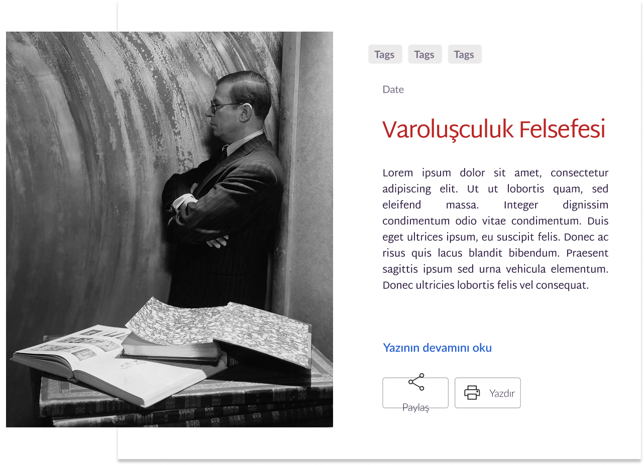
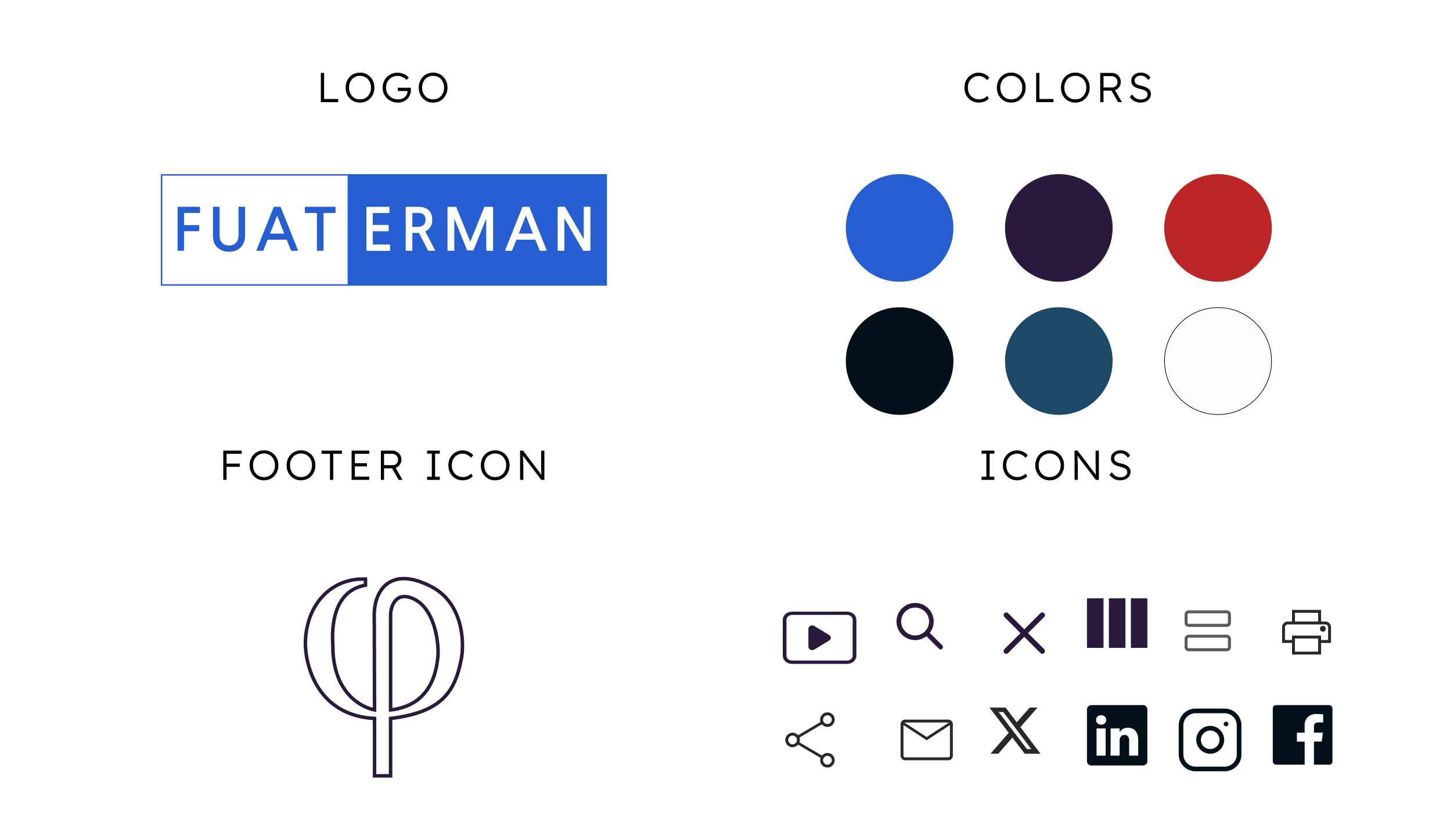
UI elements used on the website
The final platform translates a diverse body of content into a structured and navigable system.
The design introduced several key improvements:
The platform allows users to quickly understand what content is available and where to begin, while supporting deeper reading and exploration.
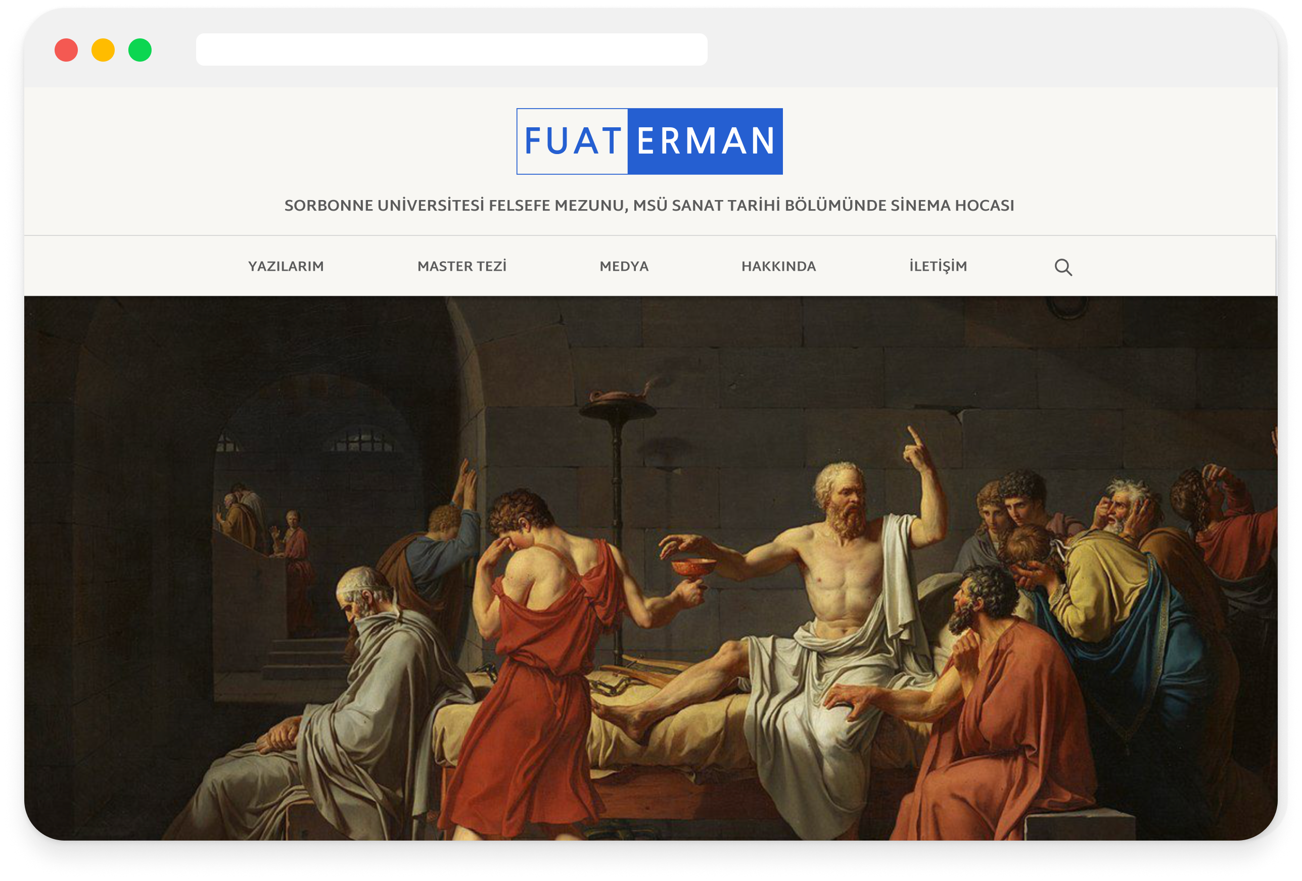
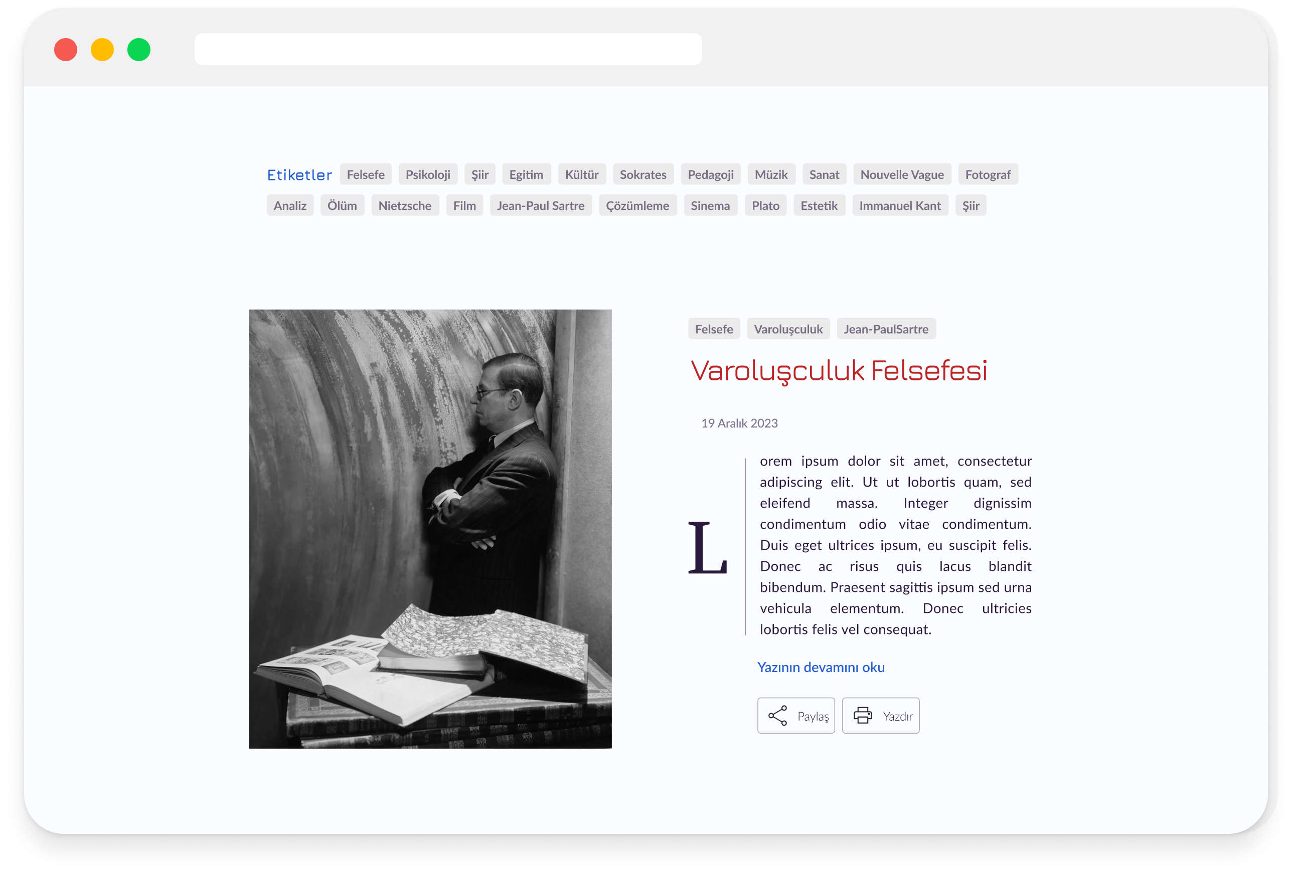
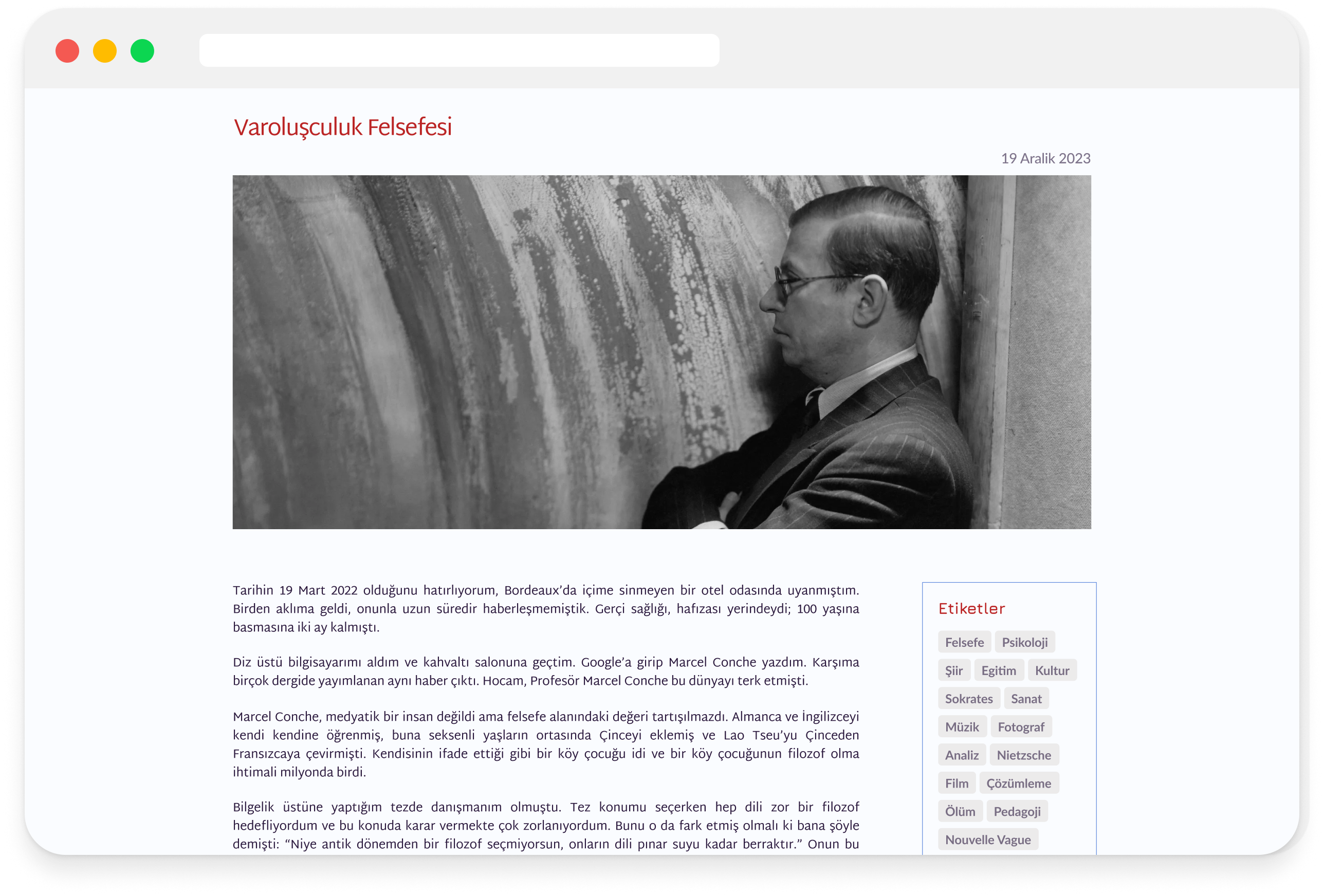
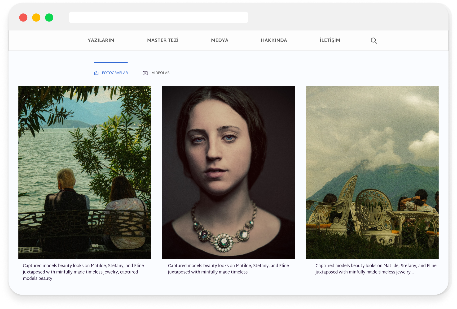
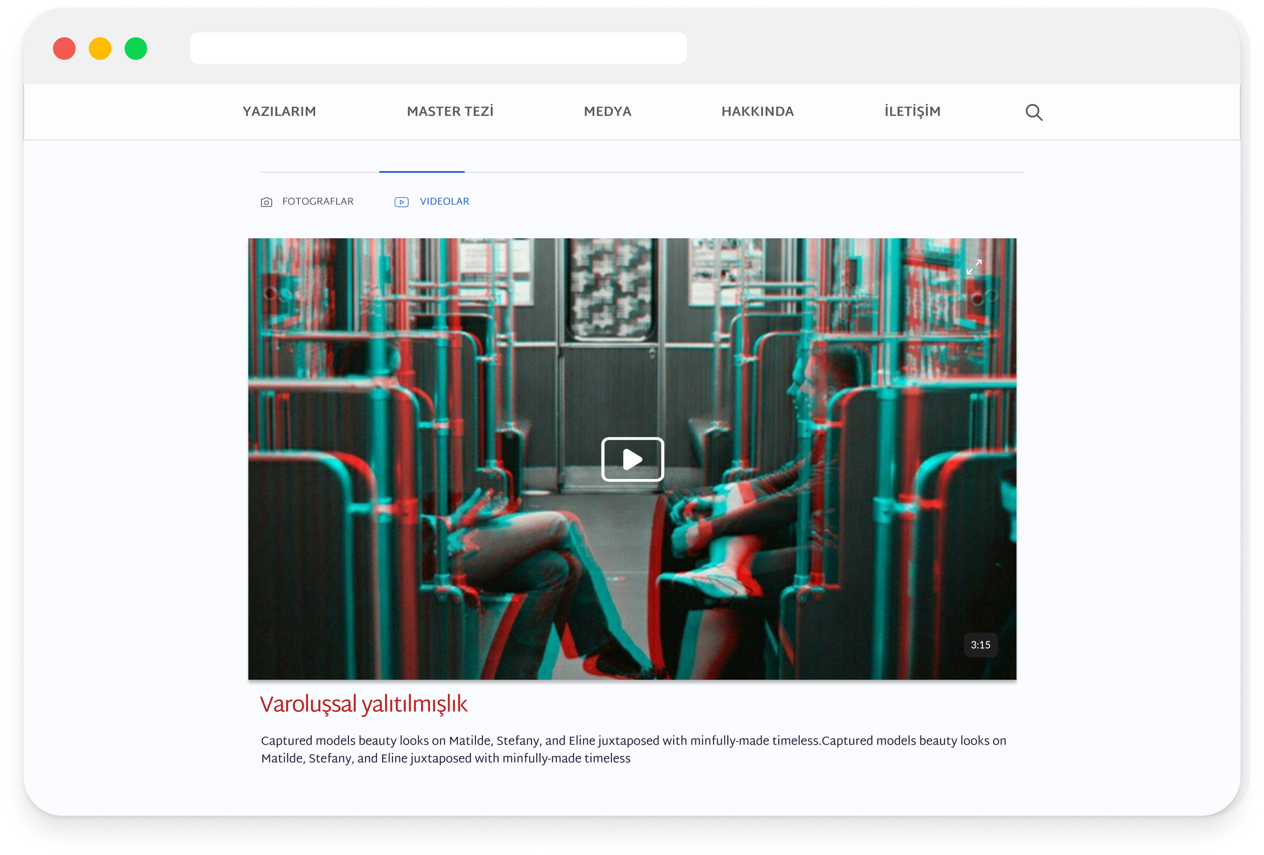
Final screens of the website
1. Content structure defines the experience
Working on a content-heavy platform showed that the way information is organized has a direct impact on usability.
When content is clearly structured, users can scan, understand and engage more easily, and navigation becomes intuitive without adding complexity. Clarity in layout is what makes content accessible.
2. Designing for reading requires restraint
This project highlighted the importance of reducing visual noise in editorial interfaces.
Instead of relying on strong visual effects:
Hierarchy was created through spacing, typography and layout.
A restrained design approach improves focus and supports long-form reading.
3. Different content types require different systems
Articles, photography and media cannot be treated the same way.
Each format needs its own structure while remaining part of a consistent system.
Separating content types while maintaining visual coherence improves both navigation and understanding.
4. Visual identity supports usability when used intentionally
Branding elements such as color and typography are not only aesthetic.
When used consistently, they guide attention, reinforce structure and make the interface easier to navigate.
Design decisions become more effective when they serve both identity and function.