
Back
Summary Equilys is a B2B platform focused on promoting inclusive practices in the workplace. It provides tools that help organizations spot and reduce discrimination in everyday workflows — for example, through writing assistants that encourage more inclusive language. The goal is to make inclusion part of day-to-day work, not just a guideline.
Equilys is a B2B company developing AI and educational solutions to promote workplace inclusion, with a focus on gender inequality.
The company was entering the market with three interconnected initiatives: an AI writing assistant, consulting services and educational learning tools.
However, there was no structured digital platform explaining how these offerings worked together.
The challenge was not simply redesigning an interface. It was turning abstract product concepts into a clear and credible B2B platform.
1. No Clear Product Hierarchy
The platform presented three services with no clear primary entry point.
As a result :
When everything is presented equally, nothing felt essential.
2. Inclusion Felt Conceptual Rather Than Practical
Inclusion and inclusive language are inherently abstract topics.
Without disciplined framing :
For B2B audiences, clarity must translate into action.
3. Weak Product Conversion Signals
As an early-stage company Equilys needed credibility.
Without a clear entry point or visible next steps :
The website needed to guide users through the offer, not just present the brand.
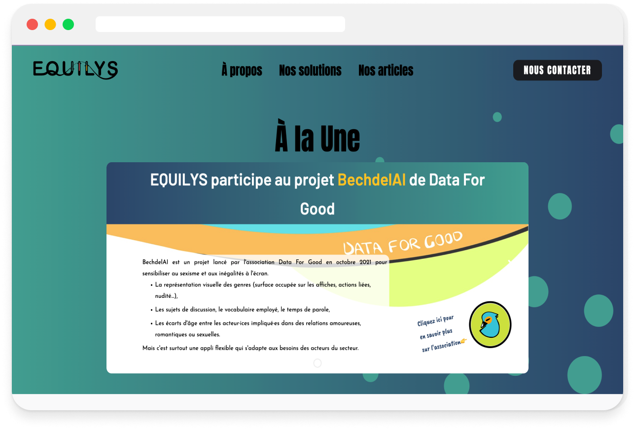
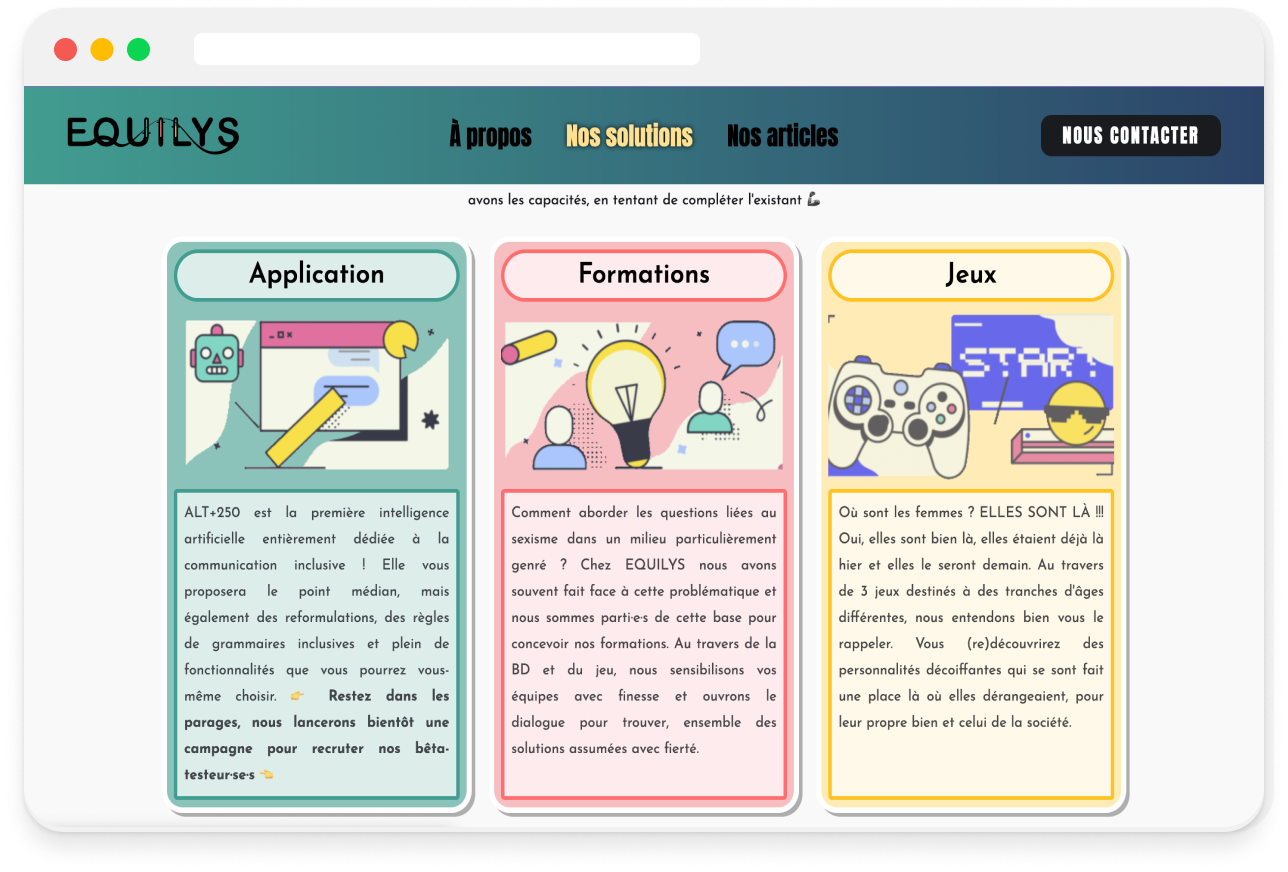
Existing Equilys website before redesign
Research Activities
To understand how the platform should be structured I conducted research across three areas :
Market Patterns
Across competitors, several patterns emerged :
Inclusion was often framed conceptually but rarely organized around decision-making.
User Findings
Interviews revealed a clear gap between awareness and implementation :
The issue wasn’t awareness. It was the absence of a practical approach.
Key Insight
HR professionals already understand the importance of inclusion. They need clarity on how to act on it.
In B2B environments clarity builds credibility.
This usually comes from:
The platform needed to function as a guided decision environment, not a brand narrative.
Design Strategy
To make the platform easier to understand, I separated :
Brand positioning from Product exploration
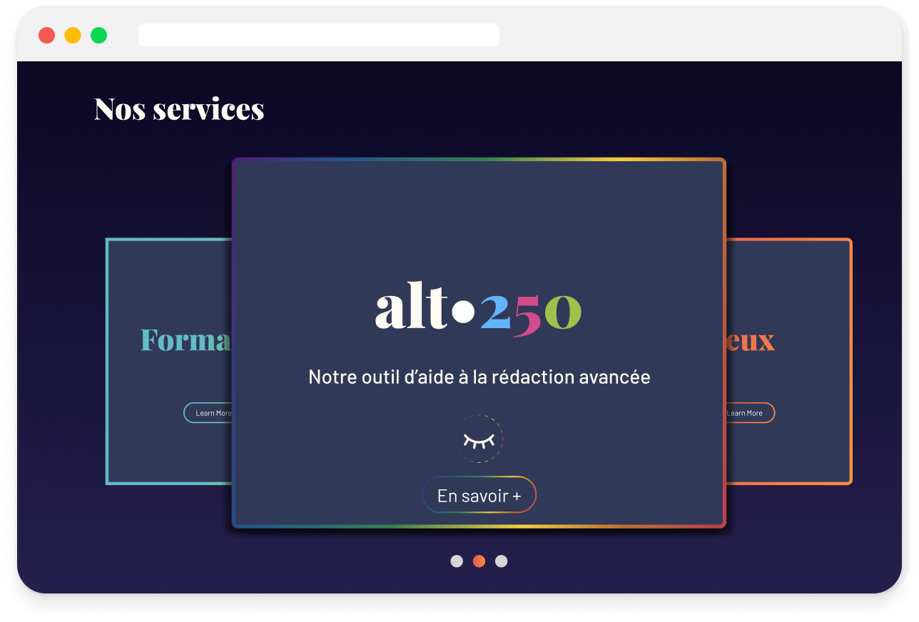
This allowed the homepage to first communicate the company’s mission, before presenting the available solutions.A dedicated product section was introduced to guide users through the three offerings.Alt 250 appears first, acting as the primary entry point while still showing the broader set of solutions.
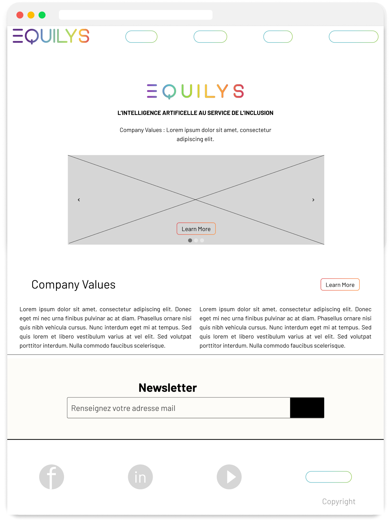
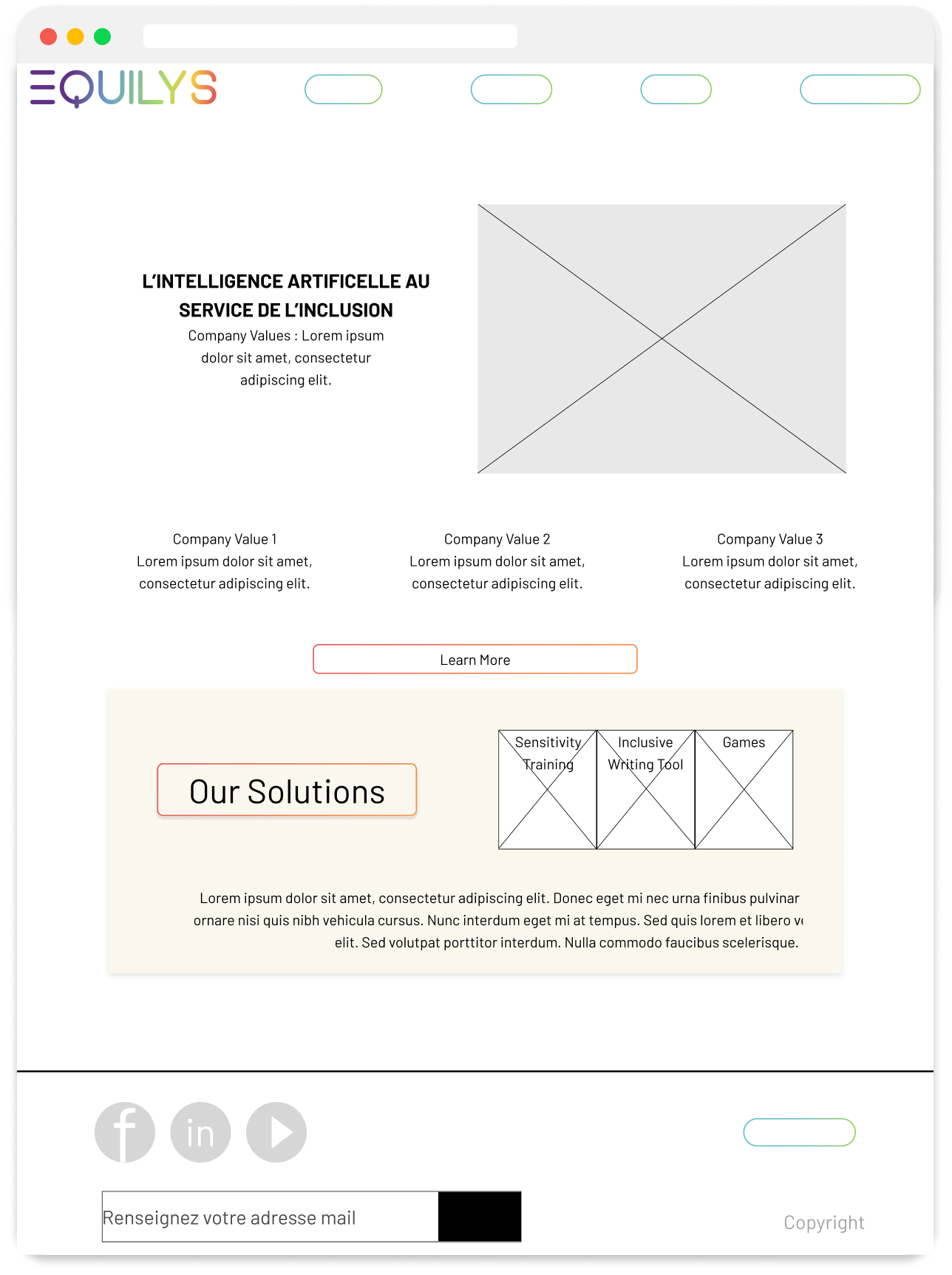
Early layout explorations testing how to introduce the three solution
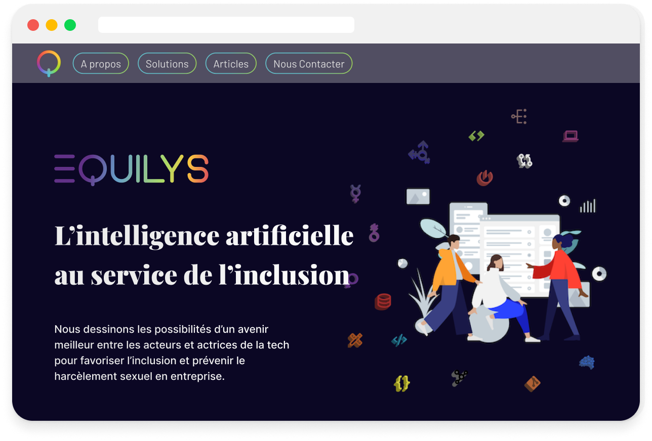
1. The hero section communicates the company mission first
The homepage opens by communicating the company’s mission :"L’intelligence artificielle au service de l’inclusion."
This establishes the purpose of the platform before introducing the available solutions.
The mission is presented clearly, without being mixed with product comparison.
2. Solutions Carousel
Directly below the hero, a dedicated services block presents the three solutions.
Key design choices :
This creates a clear progression:
Understand what the platform offers → Explore and evaluate solutions → Take action
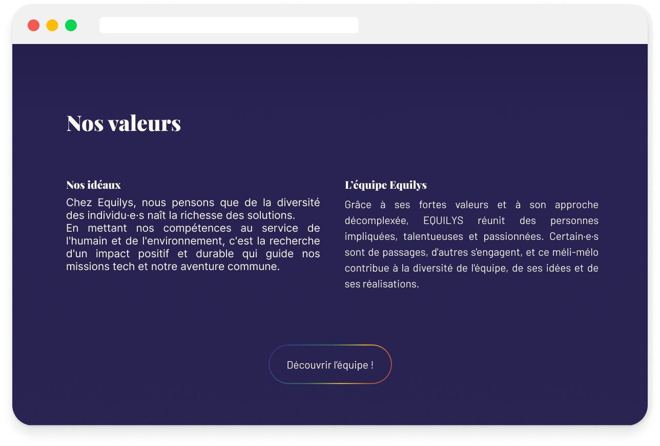
3. Familiar B2B page structure
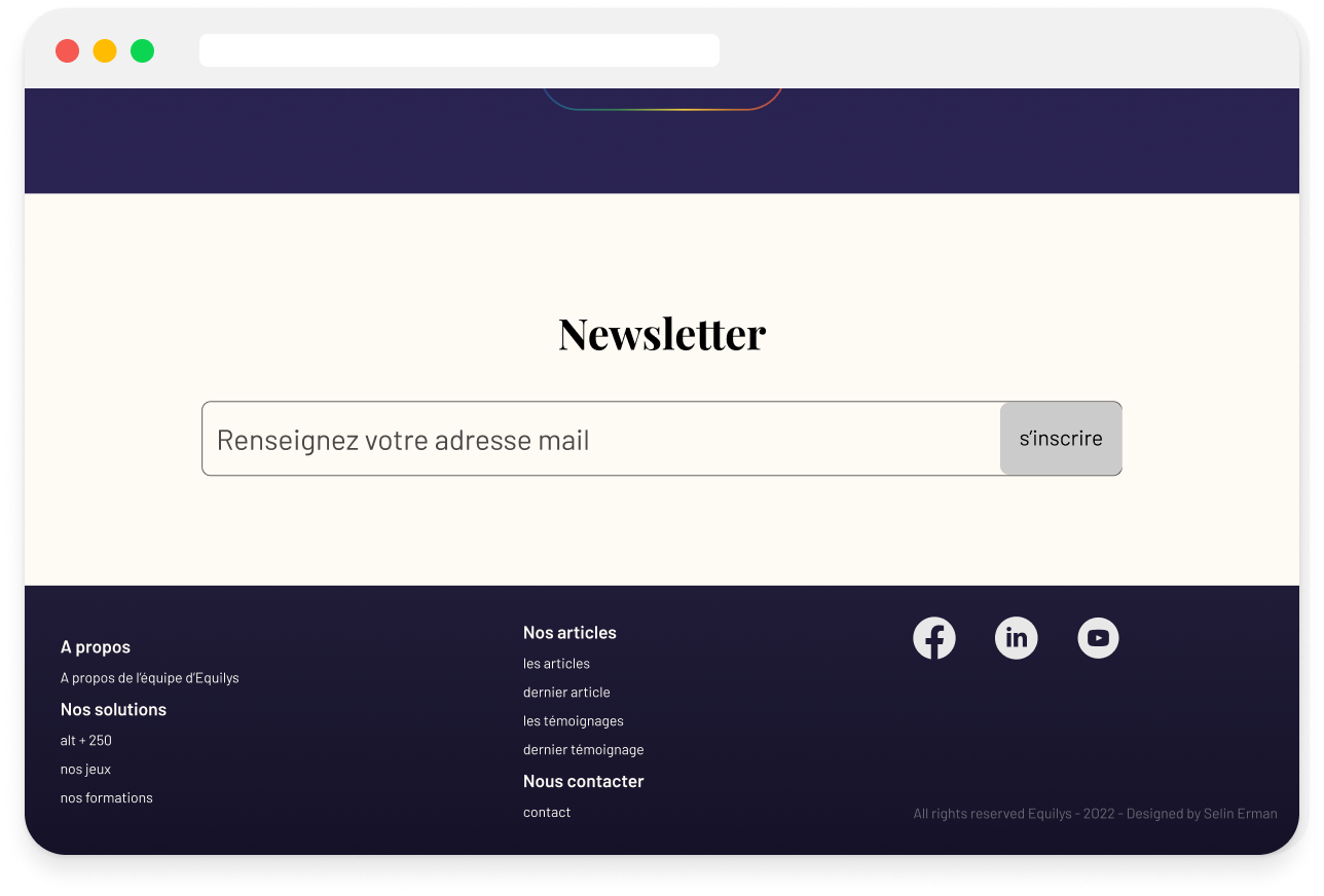
Hero → Services → Values → Newsletter
Consistent spacing and typography create a clear visual hierarchy while keeping the bold, tech-oriented visual style easy to navigate.
This structure makes the platform easier to scan and understand.
The platform is currently in development. The redesign introduced several key improvements :
The platform is now easier to understand, helping HR professionals quickly see what is offered and where to begin. The redesign turns an abstract set of initiatives into a clearer product offering.
1. How products are presented shapes how the platform is understood
When several products appear on the same website, their organization influences how people interpret the company itself.
Presenting the three products together in a dedicated section made the platform easier to scan and clarified the starting point for users.
2. Clarity matters more than visual expression
Strong visual identity helps communicate a company’s vision, but when users evaluate a B2B product they first want to understand what it offers and where to start.
This project showed that expressive branding alone is not enough. The way the products are introduced and organized plays a major role in helping users quickly understand the offer and decide where to begin.
3. Abstract topics need practical framing
Inclusion is often discussed in broad or conceptual terms. But when HR professionals evaluate tools, they need to quickly understand how those ideas translate into concrete actions.
This project highlighted the importance of presenting inclusion not just as a value, but as something that can be applied through clear and practical tools.
Future Iteration
Future iterations would include moderated usability testing to better understand :
Final Interface